
Naolib
Nantes Métropole mobility brand
The Nantes metropolitan area is centralizing all its transport services (previously offered by Tan, Effia, Nge parkings and Bicloo) under a single name: Naolib. This ambitious project, fruit of several years of consultation, aims to simplify travel thanks to a multimodal offer. Mobility is now imagined collectively, simpler, smoother and more agile.
Derived from naoned - "Nantais" in Breton - and "liberty", the name Naolib stands for simplified, virtuous mobility at the service of the citizens. This name was the starting point for our creative thinking. We were commissioned to create a visual concept around the notion of flowing mobility: the idea of moving from one form of transport to another, simply and agilely.
Naolib is imbued with the identity of the Nantes metropolis (citizen, green and creative) to inform and guide citizens in their travels. Its identity is expressed in the plural, through the diversity of travel modes and the users who use them. Naolib is thus imagined as a brand that is creative, committed, bold, accessible and territorial.
For several months, we navigated between creative and strategic challenges.
Here's the project's travel diary!
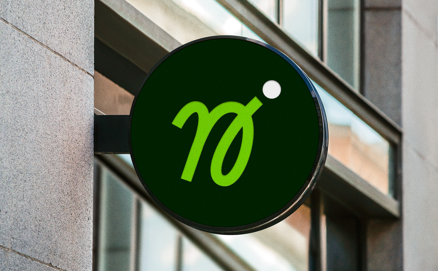
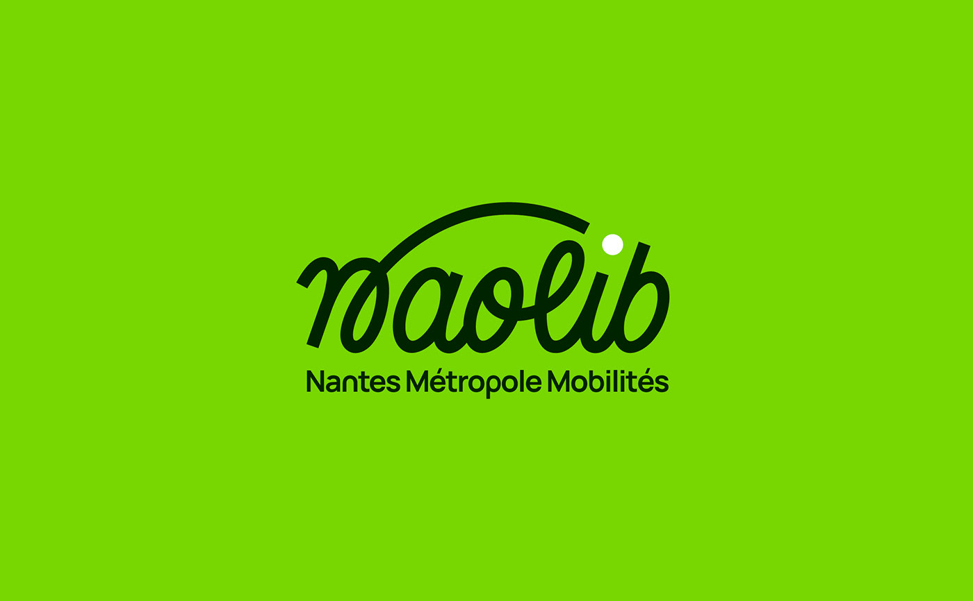
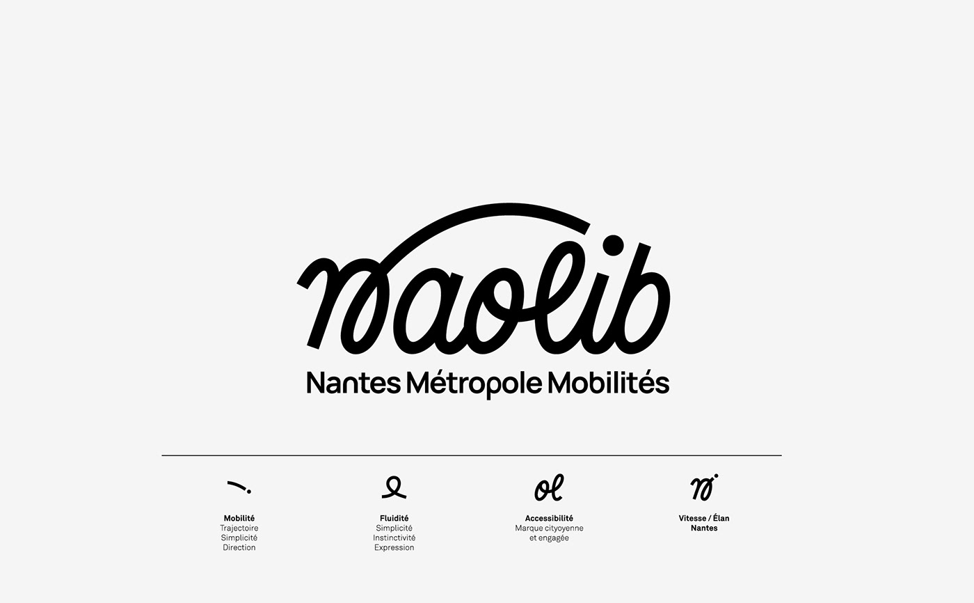
Logotype
Expressing fluidity
The logotype follows a flowing trajectory, revealing the handwritten letters n_aolib_ one by one. Its hand-drawn outline evokes a human gesture, combining roundness and bounce.
The affective sign evokes a simple, accessible route. Like a guide for the people of Nantes, the line and the dot symbolize the simplified journey from point A to point B. Speed is no longer the goal: mobility becomes smoother, easier.
In short, with "now-lib", freedom is here and now!
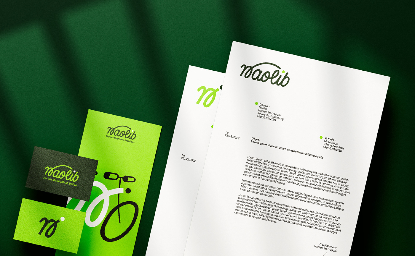
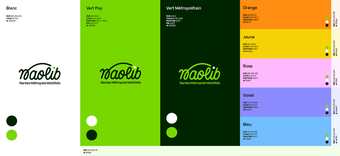
Colors
Integration into the city
The colorimetric universe is inspired by the personality of the city of Nantes: green and creative. Choices are based on what already exists, to ensure a certain visual ecology in public spaces. These include the green of the Green Line, or the "Metropolitan green" found on Nantes street furniture. While green underlines the ecological ambition of the project, a palette of secondary colors allows for a more targeted expression according to the mode of transport or the subject addressed.
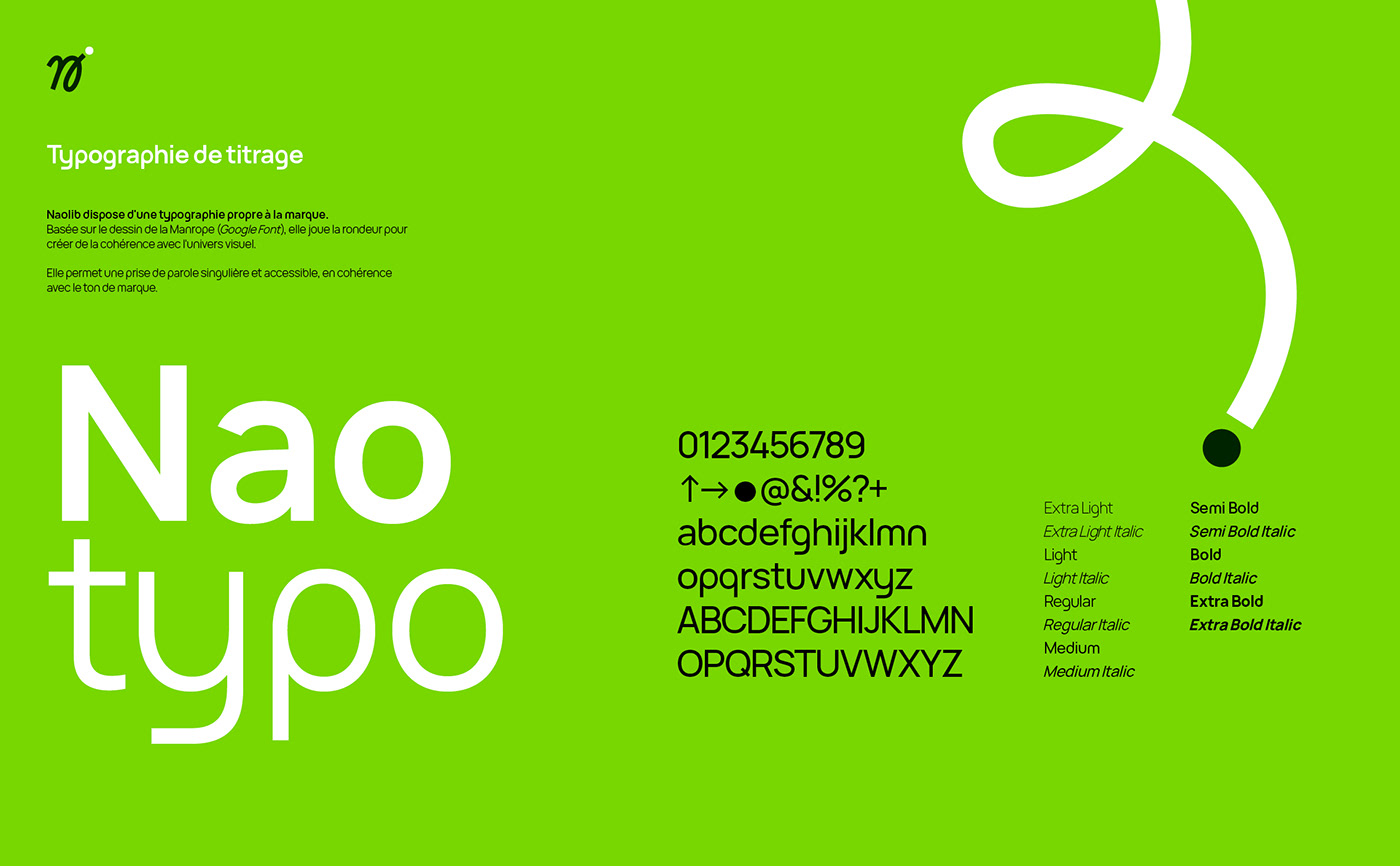
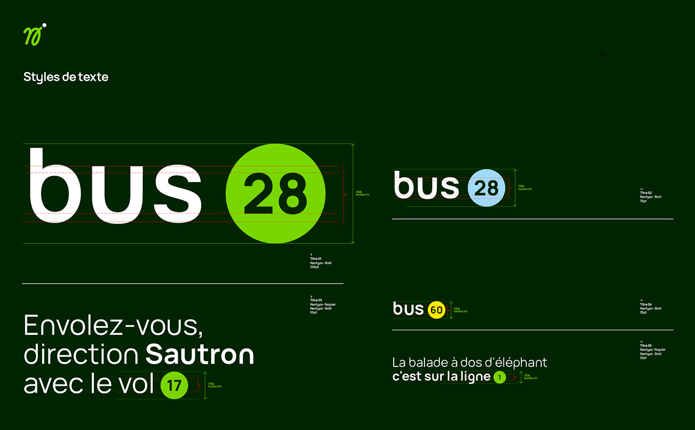
Typography
In order to convey an identifiable message in line with the project's signage needs, a bespoke typography was created. Naotypo draws on the roundness of the logotype to create a playful, accessible brand tone. Designed to become a genuine graphic tool, it integrates a large number of identity elements, accessible via keyboard shortcuts: logotypes, signs, line numbers...
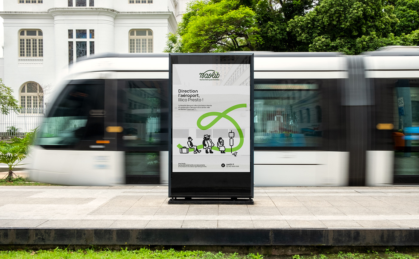
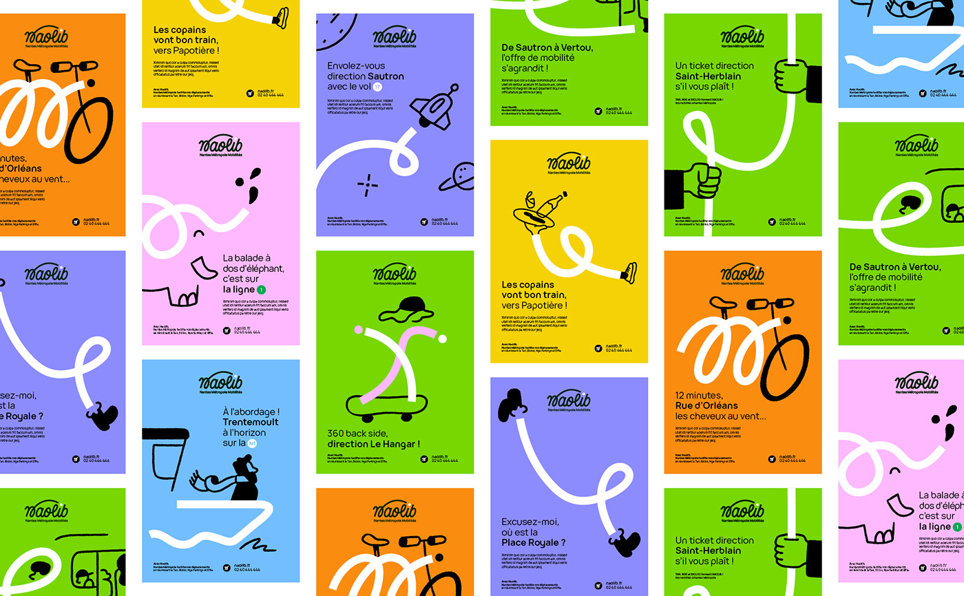
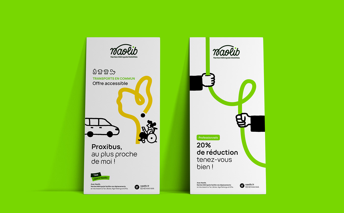
Tailor-made messages
Very quickly, the Naolib universe unfolded with its own brand tone: short, expressive messages, an obvious closeness to its audience, puns to make people smile... We provided the brand with an editorial charter to simplify the writing of future content and inspire the communications teams.
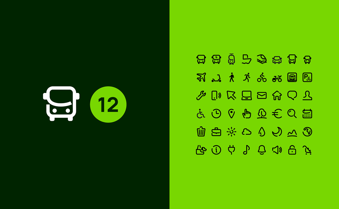
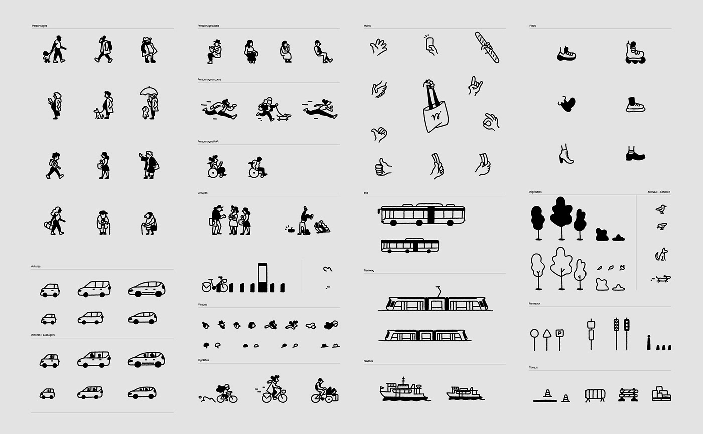
Pictograms
Naopictos
For a mobility brand, the pictogram library is an essential element. The challenge (which turned out to be more complicated than you might think) was to bring the Naolib universe to life, while complying with accessibility regulations.


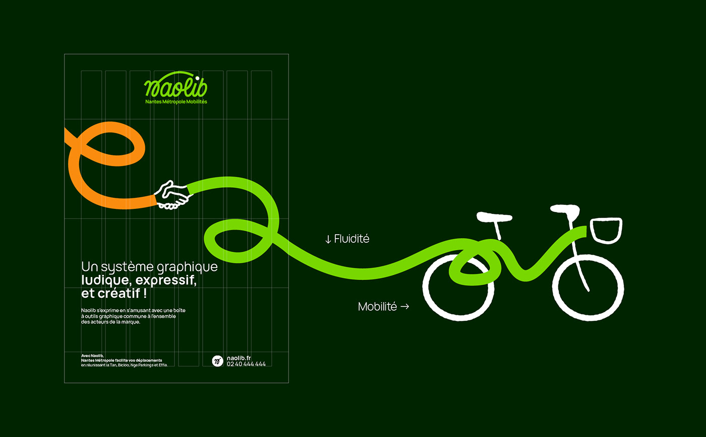
Visual universe
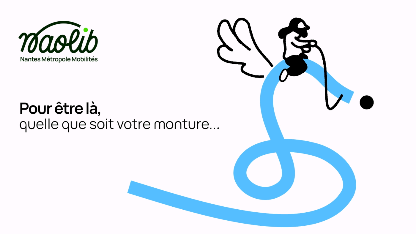
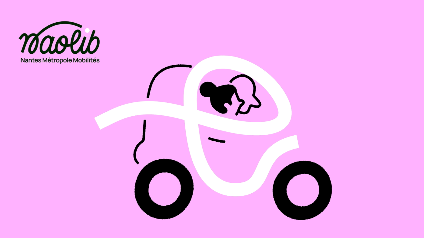
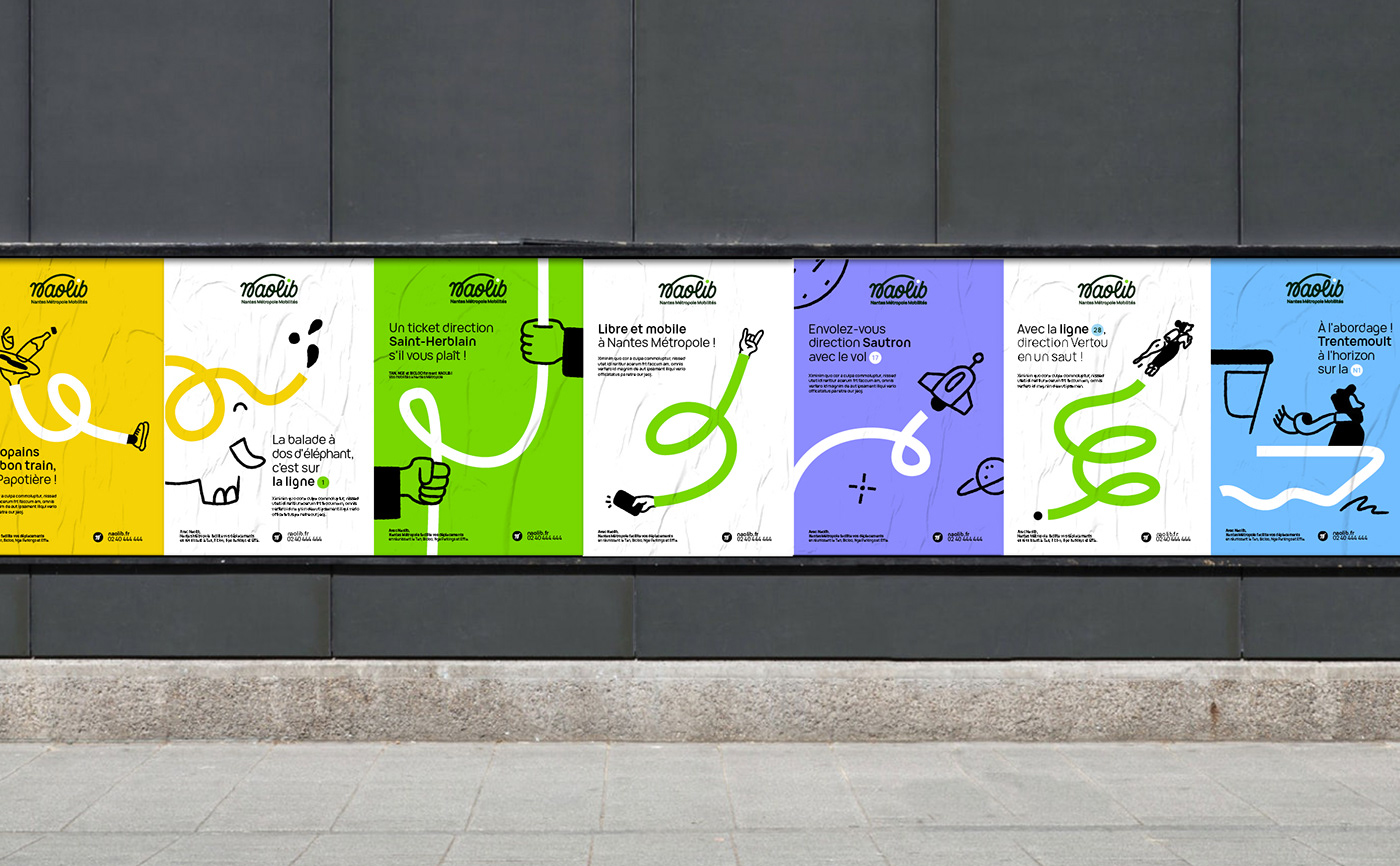
Flowing mobility
Naolib's visual and iconographic universe combines two graphic tools to express its vision of flowing mobility:
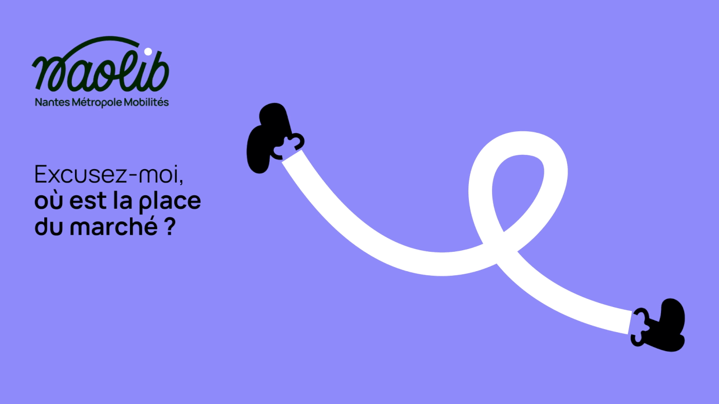
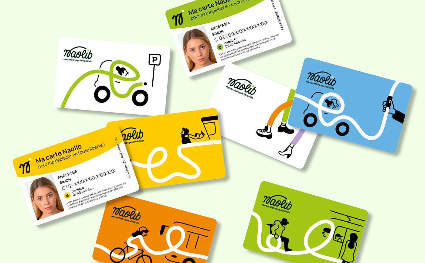
A flowing layout: This represents a smooth, fluid itinerary. Its full curves, harmonious in their twists and turns, ensure the expression of a simple and peaceful movement within the Nantes metropolis.
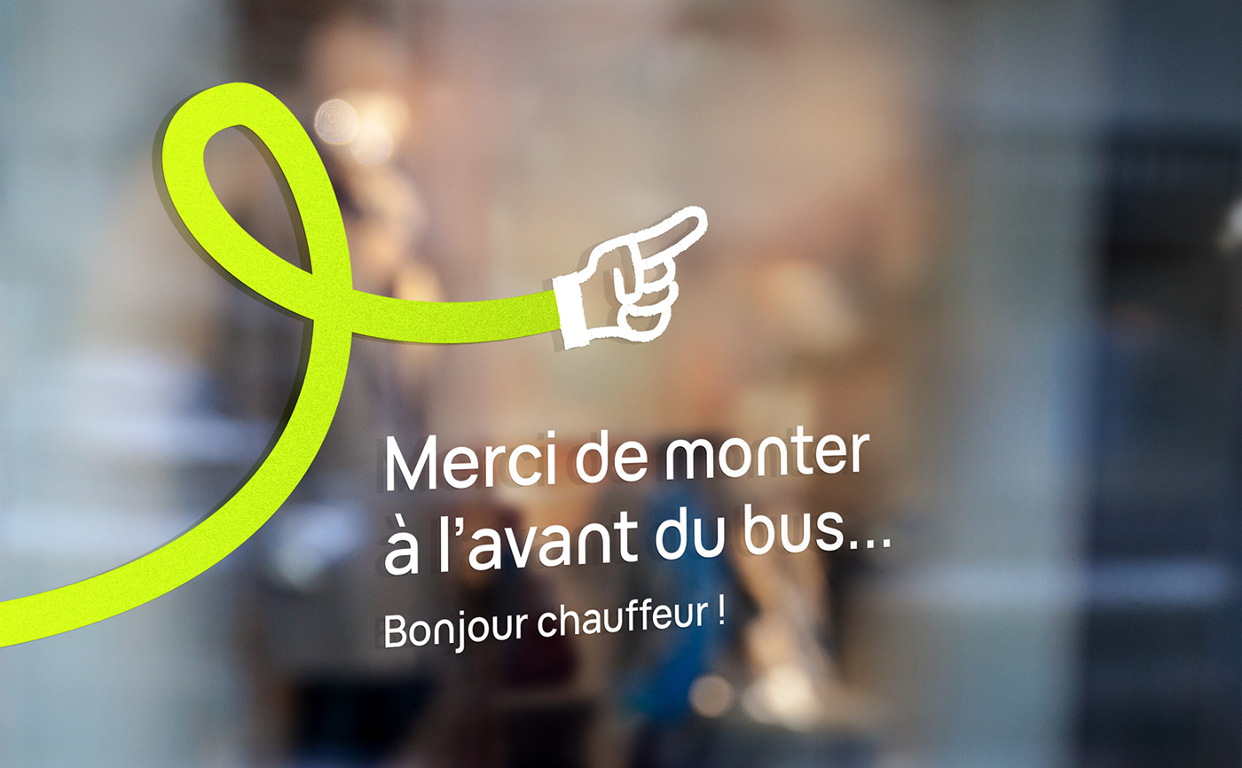
Figurative illustrations: Within the system, the layout becomes the medium for multiple scenes of mobility. Sometimes used as a road on which a bus or pedestrian travels, sometimes as an arm to which we add a hand... Its most figurative expressions represent mobility as imagined in Nantes: playful and accessible.
It's by combining these two elements that the magic of the system works. It's up to you to design mobility the way you want it!


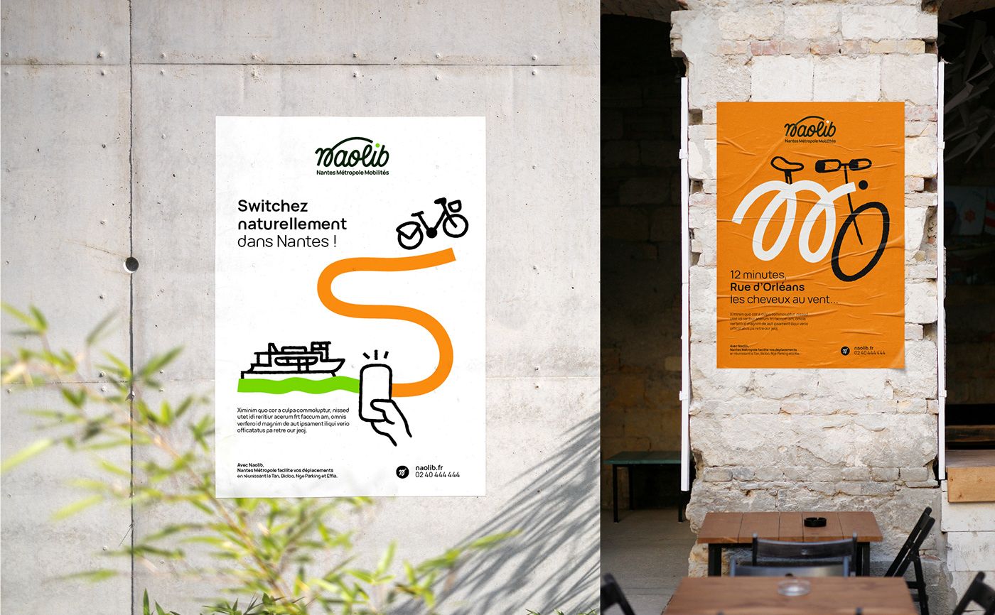

Illustration
As the project was originally conceived on paper, we had to transcribe this human gesture, this felt-tip material, onto digital creation media. Thanks to the creation of an Illustrator "brush" (retranscribing the technical roughness of a hand drawing), we created an illustrative toolbox comprising around a hundred fundamental elements: modes of transport, vegetation, contextual elements, characters... For more specific needs, the toolbox is designed to be modular, so that elements can be interchanged or a new illustration can be easily created.


Drawing your commute to work, imagining tomorrow's mobility, expressing your love for the Nantes metropolis... there are so many stories to imagine!
Together with the teams from the city and the agency, we played the game of imagining the brand's future expressions. We tell the story behind the scenes in the dedicated podcast.


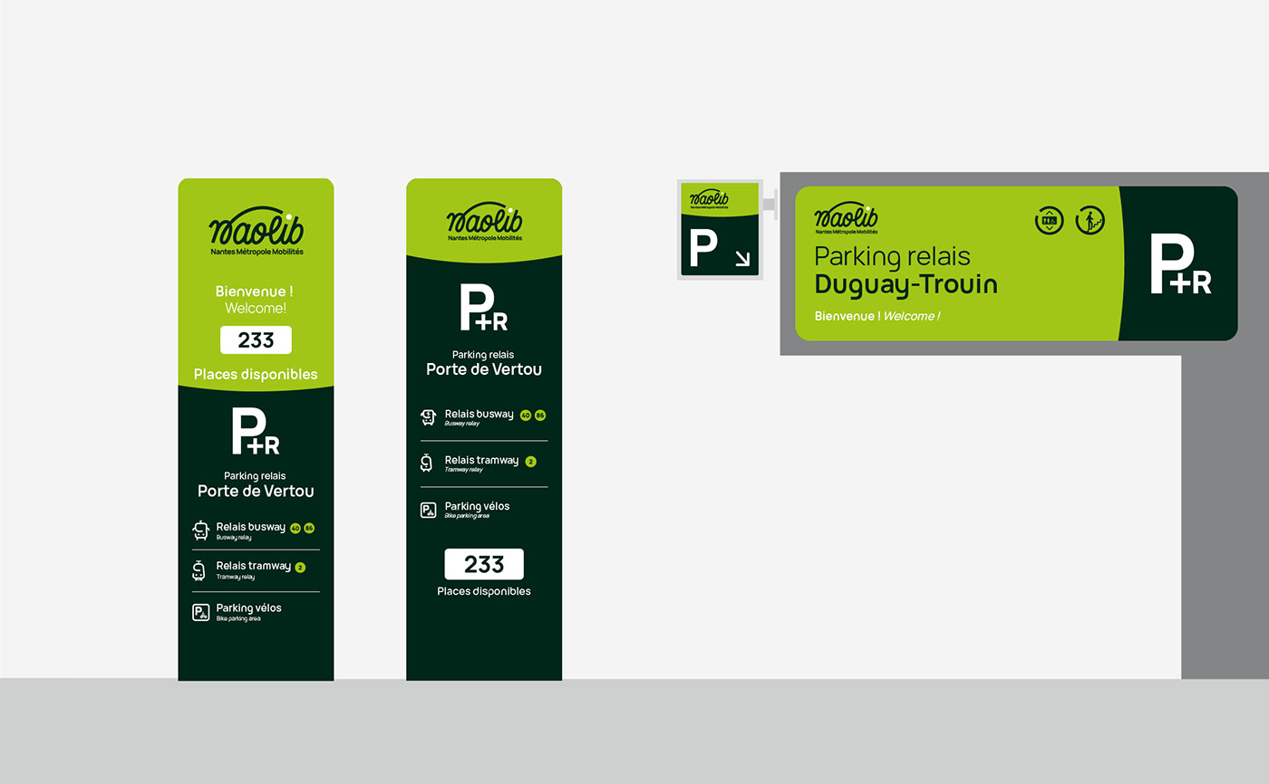
Signage
Identity in the urban environment
Once the identity had been finalized, we helped the city and its partners with the signage. While these materials are often constrained by regulatory codes, the positive personality of the brand had to be kept in mind.


Reveal
To mark the brand's unveiling to the general public, a video clip was produced to explain the background to its creation, its challenges and its values.
Thanks to Sara Burgaud, Olivier Leprévost, Xavier Crouan and all the teams at Nantes Métropole, NGE, TAN, Effia and JCDecaux, for their confidence and creativity.
Thanks to the agencies and partners with whom we had the pleasure of collaborating: Sébastien Vincent (motion design), Agence Jujotte (website), Agence Antigel (communication campaign), Agence Copenhagenize (bicycle network).


